The Regulatory Reality
Financial institutions live in a world of models. Credit risk models, market risk models, operational risk models – thousands of algorithms making billions of decisions that determine who gets loans, how much capital banks need to hold, and whether financial systems remain stable.
When these models fail, economies collapse. When they’re poorly managed, regulators impose massive fines. When they’re not properly documented, audits become nightmares.
Crisil’s Model Infinity was designed to solve the chaos of model risk management through systematic process design and comprehensive oversight capabilities.
The Stakeholder Complexity Map
Model risk management involves more moving parts than most enterprise software. My research revealed a web of interdependent roles, each with different priorities and success metrics:
Model Developers create and maintain the algorithms
Model Validators stress-test and challenge model assumptions
Risk Managers oversee model performance and compliance
Auditors verify that everything follows regulatory requirements
Business Users rely on model outputs for decision-making
Each group needed different information, different workflows, and different levels of detail. The challenge was creating one platform that served all these needs without overwhelming anyone.
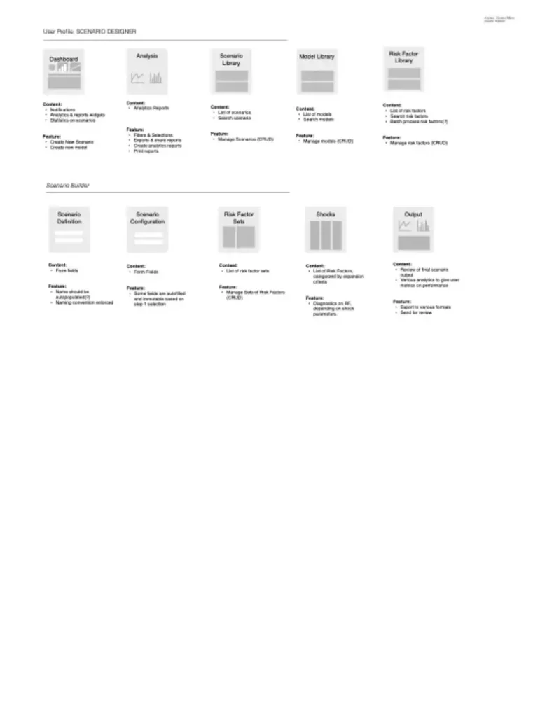
Process Mapping Before Interface Design
I spent weeks mapping existing model governance workflows – not just the official processes documented in compliance manuals, but how work actually got done.

Discovery findings:
- Model documentation was scattered across email, shared drives, and individual laptops
- Validation processes varied dramatically between teams and model types
- Version control was manual and error-prone
- Regulatory requirements were interpreted differently across departments
- Knowledge transfer during staff changes was inconsistent and incomplete
The current state was functional but fragile. Any process improvement had to acknowledge existing workflows while gradually introducing better practices.
Information Architecture for Regulatory Compliance
The platform’s IA needed to accommodate three distinct requirements simultaneously:
- Operational efficiency for daily users
- Regulatory compliance for auditors and examiners
- Executive oversight for risk management and business leadership
I developed a layered architecture that could present the same underlying data through different lenses:
Operational View: Task-focused interfaces for model developers and validators
Compliance View: Audit trail and documentation interfaces for regulatory reporting
Strategic View: Portfolio-level dashboards for risk management and executive teams
Workflow Automation Design
The platform’s core value proposition was automating manual processes while maintaining regulatory rigor. This required careful analysis of which steps could be automated versus which required human judgment.
Automation opportunities:
- Document template population based on model metadata
- Workflow routing based on model type and risk tier
- Notification triggers for validation deadlines and regulatory milestones
- Report generation for standard compliance requirements
Human oversight requirements:
- Model validation sign-offs
- Risk assessment judgments
- Exception approvals
- Strategic model governance decisions
Design for Multiple Mental Models
Different user types approached model information with completely different mental frameworks:
Developers thought in terms of model performance and technical specifications
Validators focused on testing scenarios and potential failure modes
Risk Managers considered portfolio-level exposure and concentration risk
Auditors emphasized documentation completeness and process compliance
The interface design needed to accommodate these different perspectives without forcing users to adopt unfamiliar conceptual models.
Regulatory Constraint Design
Every design decision existed within regulatory boundaries defined by SR 11-7, TRIM, SS 1/23, and other global standards. This wasn’t about adding compliance as a feature – it was about designing compliance into the foundation.
Design implications:
- All user actions needed comprehensive audit trails
- Data retention policies influenced information architecture decisions
- Role-based access controls determined interface complexity
- Documentation requirements shaped form design and validation logic
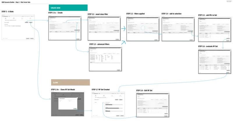
Prototype Strategy for Complex Workflows
Standard prototyping approaches didn’t work for model governance workflows. These processes often span weeks or months, involve multiple stakeholders, and include exception handling that’s difficult to demonstrate in typical demos.
I developed scenario-based prototypes that walked stakeholders through complete model lifecycle examples, including edge cases and error conditions. This helped validate both normal workflows and exception handling approaches.

The Implementation Challenge
Model Infinity needed to integrate with existing model development tools, risk systems, and regulatory reporting platforms. The design had to accommodate:
- Data imports from multiple model development environments
- Integration with enterprise risk management systems
- Export capabilities for regulatory reporting requirements
- API connections to facilitate workflow automation
This required interface design that could handle data inconsistencies and integration failures gracefully while maintaining user productivity.

Measuring Success in Regulated Environments
Success metrics for regulatory software are different from typical enterprise applications. User satisfaction matters, but compliance completeness matters more.
Primary success indicators:
- Reduction in model documentation time
- Improvement in audit preparation efficiency
- Decrease in regulatory finding severity
- Increase in model governance consistency across teams
Secondary indicators:
- User adoption rates across different stakeholder groups
- System uptime and performance during regulatory examinations
- Integration success with existing tools and processes
The Systematic Approach
Model Infinity succeeded because it systematized what had previously been ad hoc. The platform didn’t just digitize existing processes – it created better processes and then made those processes easier to follow.
The user experience design supported this systematic approach by making the right actions obvious and the wrong actions difficult. Good governance became the path of least resistance.
Lessons in Regulatory Design
Designing for highly regulated industries requires different priorities than consumer software. Users will tolerate interface complexity if it helps them avoid regulatory problems. They value comprehensive functionality over simplified workflows.
The most important design principle was transparency – users needed to understand not just what the system was doing, but why it was doing it and how it supported their compliance obligations.
Model Infinity demonstrated that regulatory software doesn’t have to be painful to use, but it does have to be designed with regulatory success as the primary objective.